- Google Docs’ Document Tabs feature enables organized sections within one document, simplifying multitasking and reducing clutter.
- Mobile-friendly navigation and nested sub-tabs create a structured, clutter-free workspace.
- Easily share specific sections for focused teamwork and export as one document with tab names as headers for clarity.
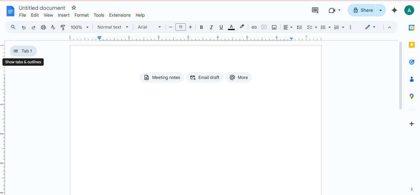
When Google announced the new “Document Tabs” feature this year, I was immediately intrigued. You can find this option at the top-left corner, where the outline button used to be was a small label: “Show Tabs & Outlines.”

For years, I’ve relied on Google Docs not only as my primary writing tool but as my “catch-all” hub. It’s where I draft articles, stash research notes, and jot down ideas at odd hours. I loved its simplicity but often felt frustrated by the limited options for managing multiple files within one project.
So when I saw that Document Tabs aimed to streamline file organization and simplify multitasking, I knew I had to try it. After a few weeks of experimenting, I realized this feature was more than a minor update; it was a productivity game-changer.
The Chaos Of Google Docs Before Document Tabs
Let me take you through a typical writing day with pre-document Tabs. Let’s say I’m working on an article. I’d have my draft open, another document with rough notes and ideas, and perhaps one more with relevant research pulled from online sources.
This setup sounds fine in theory, but when switching between these three files, I’d find myself getting lost or accidentally closing one document, leading to a frantic search in Google Drive to retrieve it. It could be a better workflow.

I tried using the Docs “Outline feature” to organize sections, which auto-generated a table of contents from headers. Although helpful, it still left me scrolling through overly long documents. I’d end up with a messy outline that did little more than clutter my workspace.
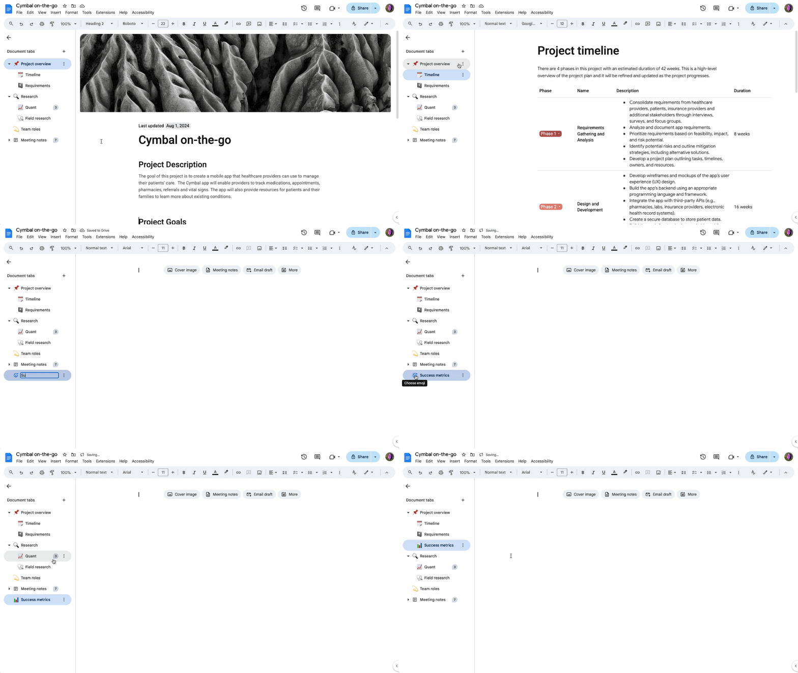
So, when Google announced Document Tabs, I knew I had to try it out immediately. Instead of separate files and tabs in my browser, I can consolidate an entire project into one document, with separate tabs neatly arranged and just a click away.
Getting Hands-On With Document Tabs
Document Tabs, which has replaced the old outlining system, let you create separate “tabs” within a document, each acting as its workspace. Now, when using Google Docs in Chrome, you can easily switch between sections, keeping your workflow organized. So, no more jumping between multiple browser tabs.
This feature is even handier on mobile, where switching between tabs on a small screen can feel like a chore. Document Tabs appear at the bottom of the screen, with simple arrows to toggle between them.
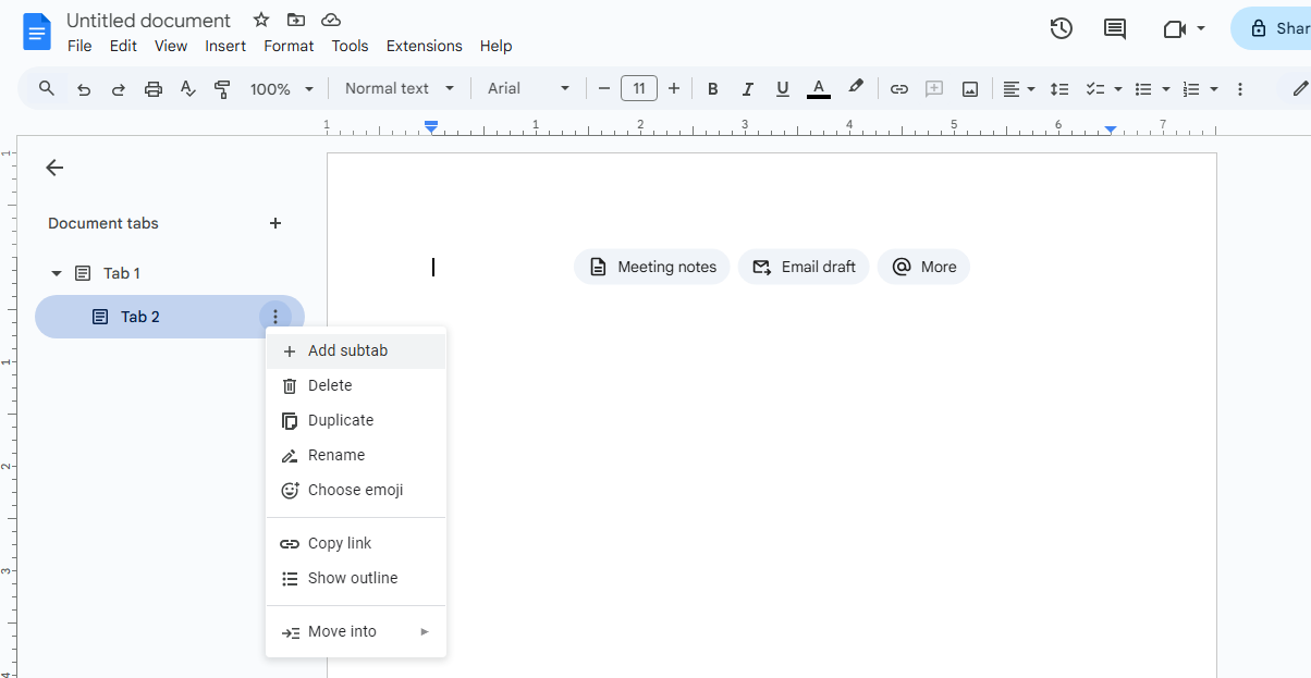
One of the standout features is the ability to create nested subtabs, which allows for further organization within each section, keeping documents clear without needing additional tabs. This is particularly helpful for complex projects with multiple content layers, as it keeps everything structured in one location.

For collaborative work, this feature is a game-changer. With each tab functioning as a distinct workspace, users can share direct links to individual tabs, granting collaborators access only to specific sections. This prevents unnecessary navigation and allows focused feedback on relevant parts of the document.
When exporting, Google Docs consolidates all tabs into a single file, using the tab names as section headers, which preserves the document’s organized structure and simplifies sharing and review.
In sum, Document Tabs is a small but powerful feature that has changed how I work with Google Docs. If you value a well-organized workspace, give Document Tabs a try; it could also transform your workflow.
Thank you! Please share your positive feedback. 🔋
How could we improve this post? Please Help us. 😔


 Threads


